
Case Study: Papa's
Crafting an Authentic & Rustic Identity for a Food Product Line
Crafting an Authentic & Rustic Identity for a Food Product Line
Papa's
CPG / Food & Beverage
Brand Identity, Packaging Design, Label Design
Create a warm, trustworthy, and authentic brand for sauces and spices
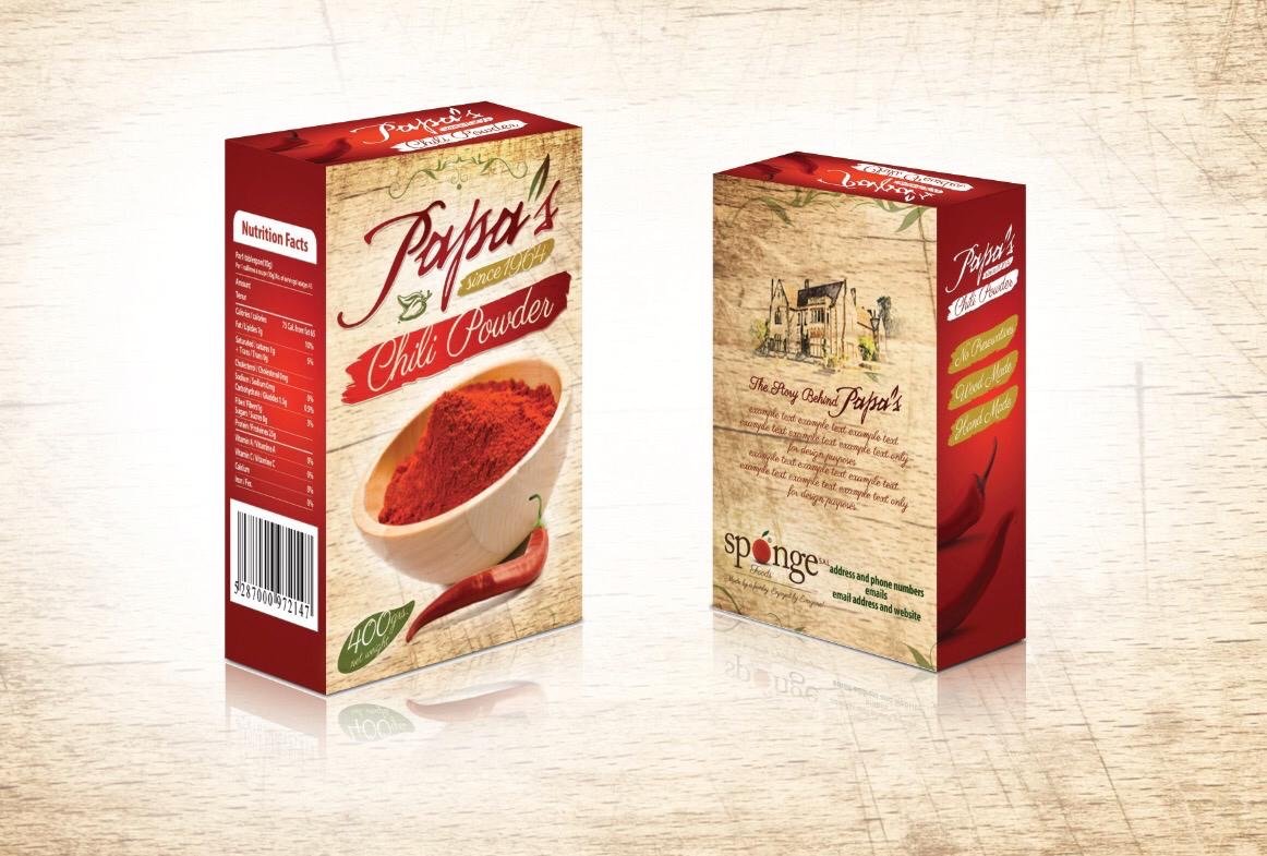
In the crowded market of sauces and spices, brands need to connect with consumers on an emotional level. The "Papa's" brand name implies heritage, family, and homemade quality. The challenge was to create a brand identity and packaging suite that visually delivered on that promise. We needed to design collateral that felt authentic, rustic, and trustworthy, making the product stand out on the shelf and feel like a genuine, high-quality choice for family meals.
We built the Papa's brand around a core aesthetic of rustic authenticity. Our strategy was to use textures, handcrafted typography, and warm colors to create a feeling of heritage and quality that customers can trust.
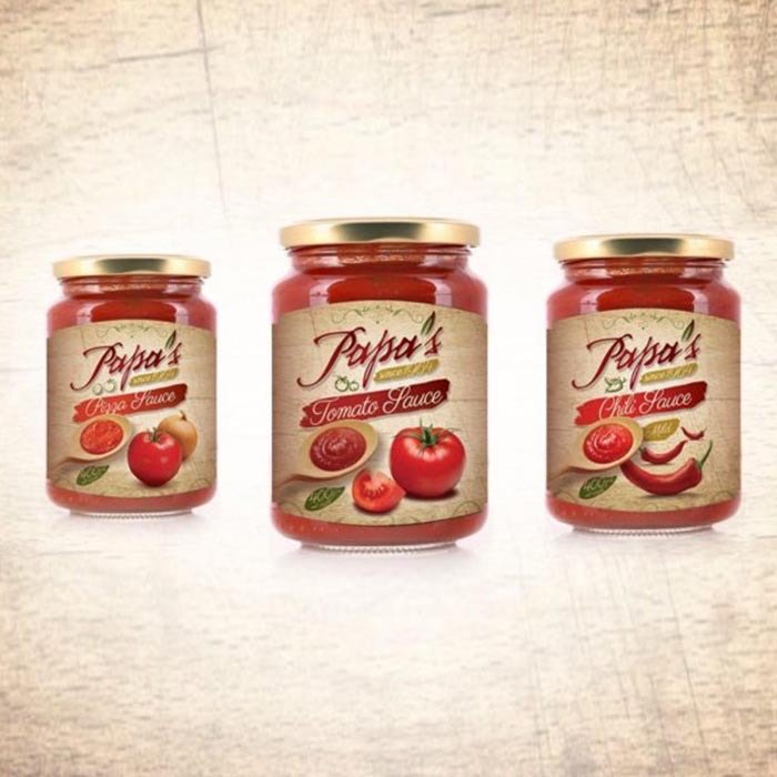
We designed a flexible label system that could be adapted for a variety of sauces, each with its own unique flavor profile.
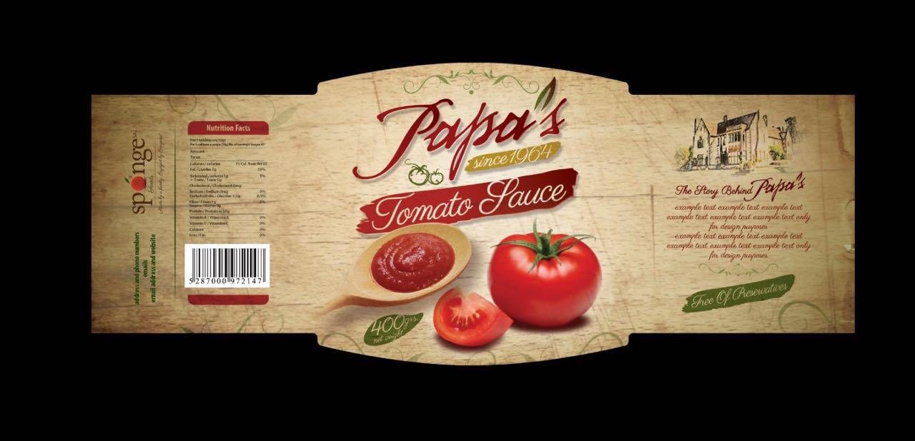
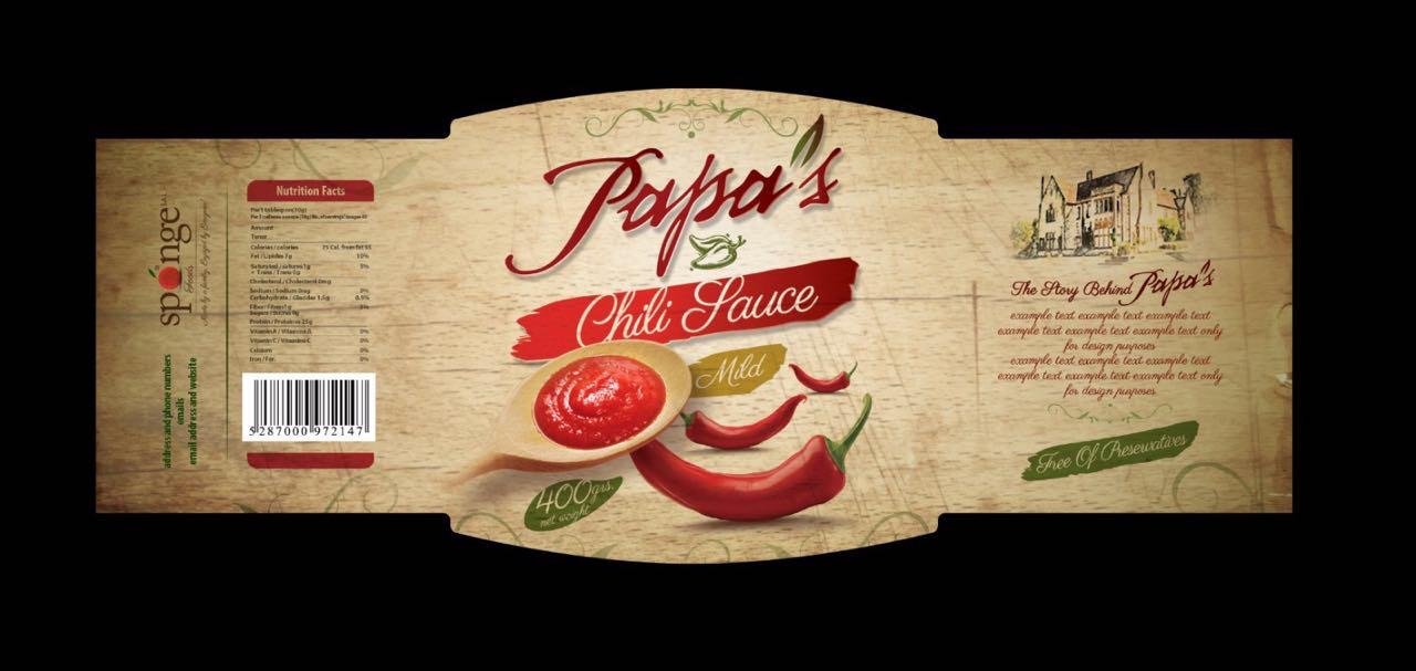
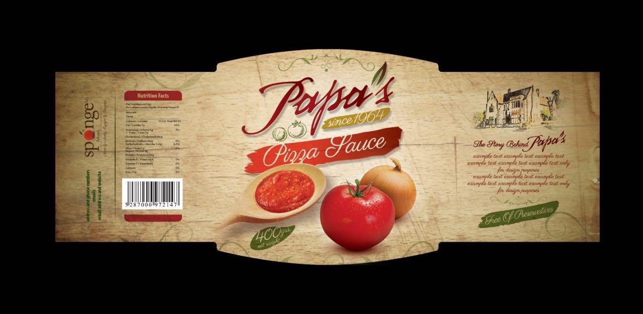
The label designs were applied to final packaging mockups, showcasing the market-ready products.
Papa's was successfully launched with a warm and authentic brand identity that perfectly communicates its core values of family, heritage, and quality. The rustic, textured packaging stands out on crowded store shelves, and the cohesive design across all product lines builds strong brand recognition. The final collateral gives Papa's a powerful foundation to connect with customers and grow their market share.