
Case Study: Super Gyros
Forging a Sizzling-Hot Brand Identity for a Fast-Casual Favorite
Forging a Sizzling-Hot Brand Identity for a Fast-Casual Favorite
Super Gyros Restaurant
Food & Beverage / Fast-Casual
Full Brand Identity, Logo Design, Signage
Create a memorable brand to stand out in a competitive market
Super Gyros needed a brand identity that would instantly communicate delicious, authentic, and high-energy food in a crowded fast-casual restaurant market. The goal was to create a unique and highly memorable logo that was more than just a generic flame or food illustration. The final identity had to be bold enough to stand out on a storefront and flexible enough for menus, packaging, and digital marketing.
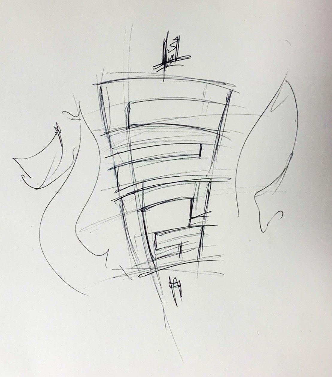
Our approach was to transform a hand-drawn artistic concept into a mathematically balanced and professional brand mark. The strategy involved three key stages:
The final identity system features a warm, appetizing color palette and versatile logo lockups designed for every application.

The full logo featuring custom script typography. This version is perfect for primary branding, packaging, and vertical applications.
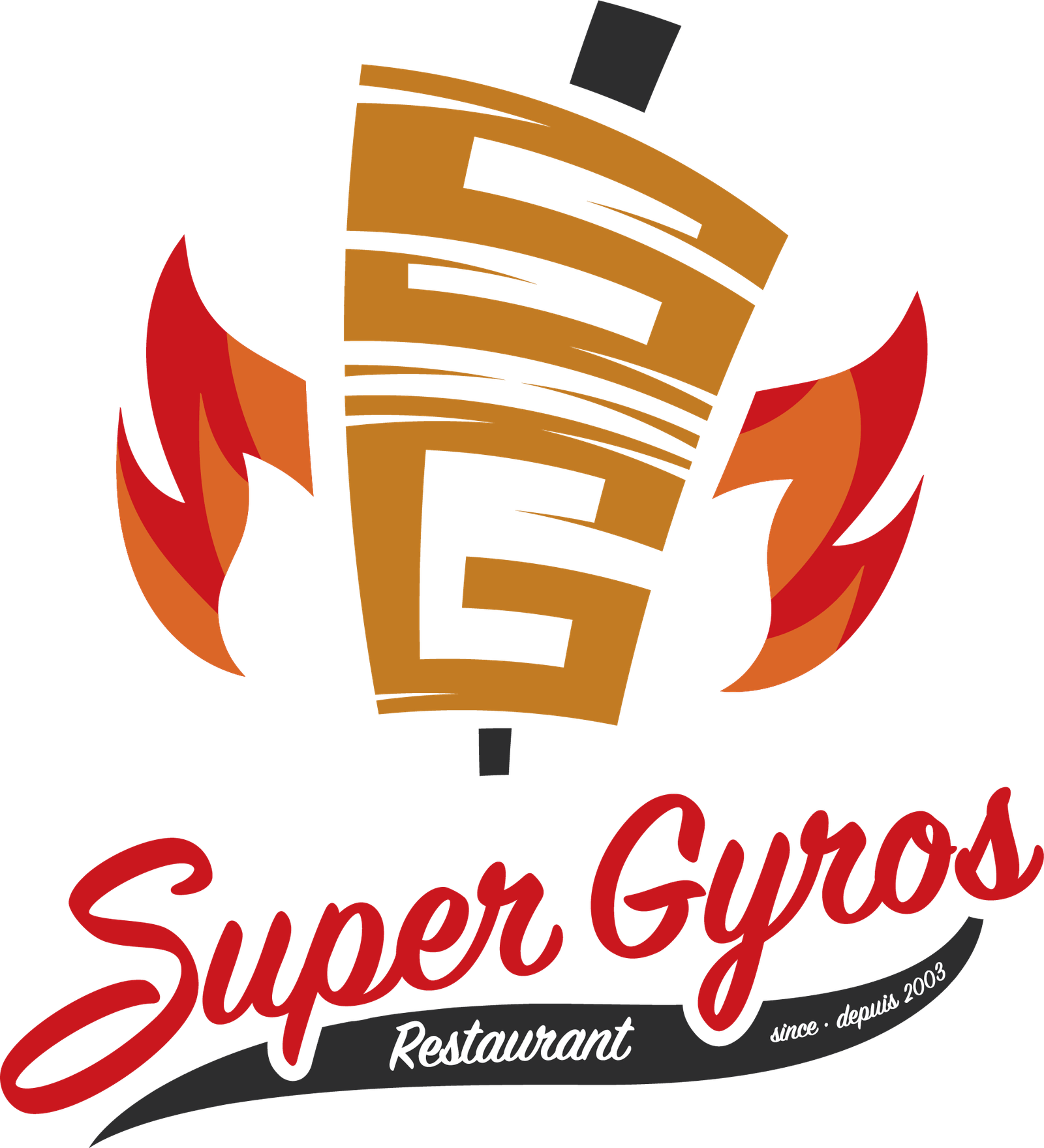
The core brand mark. A bold, modern icon that is instantly recognizable and tells the brand's story at a glance.
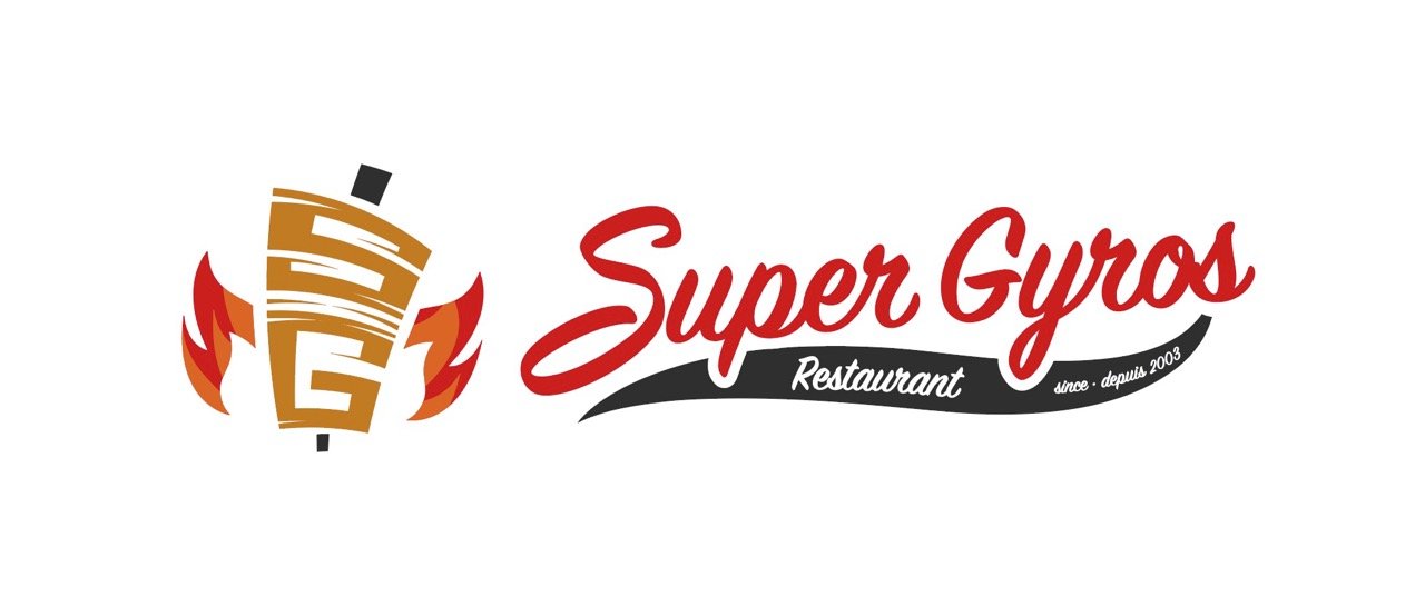
A wide-format version of the logo, strategically designed for storefront signage, website headers, and other horizontal spaces.
Super Gyros now has a powerful and appetizing brand identity that truly stands out. The unique "SG" spit logo is memorable, tells a story, and works flawlessly across all mediums—from the main restaurant sign to social media profiles. The brand now effectively communicates its core values of energy, flavor, and quality, giving it a significant competitive edge.