Case Study: Euro Deli
"Le Goût du Bonheur" — Crafting a Landmark Identity Steeped in Heritage
"Le Goût du Bonheur" — Crafting a Landmark Identity Steeped in Heritage
Euro Deli
Specialty Foods / Delicatessen
Full Brand Identity, Custom Illustration, Signage
Honor a rich family history and communicate timeless authenticity
Euro Deli, a beloved local institution founded in 1994, needed a new brand identity that could encapsulate decades of history, family values, and a unique dual heritage—Italian roots planted firmly in Quebec soil. The challenge was not to invent something new, but to create a timeless emblem that tells a rich, layered story of authenticity, passion, and quality, resonating with a community that has trusted them for generations.
Our process was built on a narrative-driven approach, designed to translate a rich history into a single, cohesive emblem. We focused on three core strategic pillars:
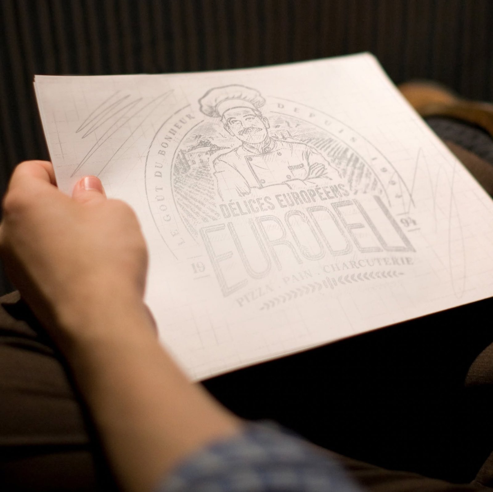
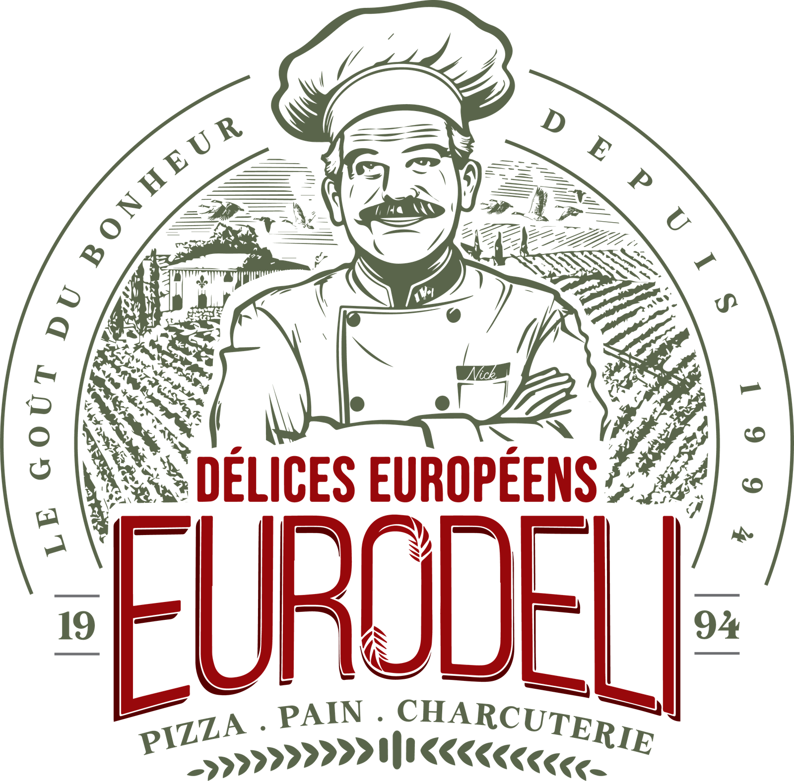
Every element within the emblem was meticulously chosen to tell a part of the Euro Deli story, creating a tapestry of meaning.

A portrait of co-founder Nick, who stands as the central figure, symbolizing the family leadership and heritage at the heart of the business.
The landscape in the background depicts an Italian village, anchoring the brand in its rich European and specifically Italian origins.
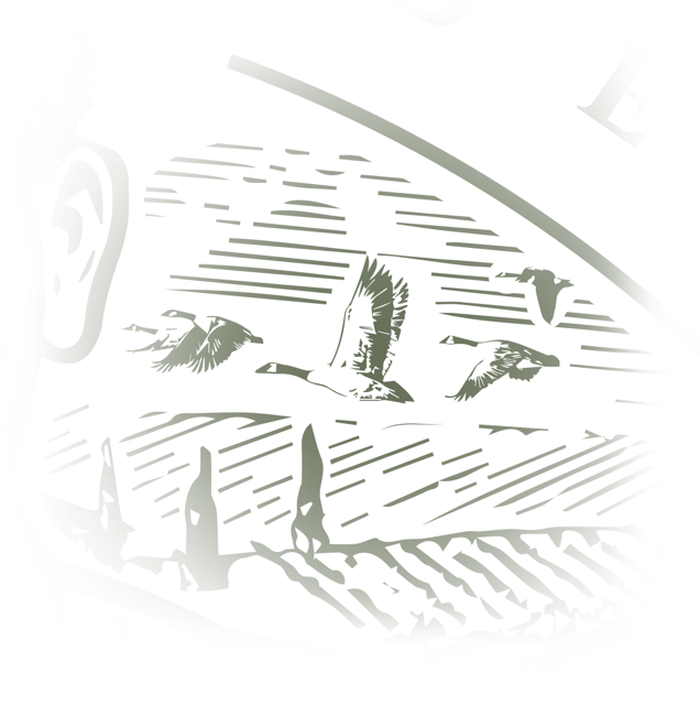
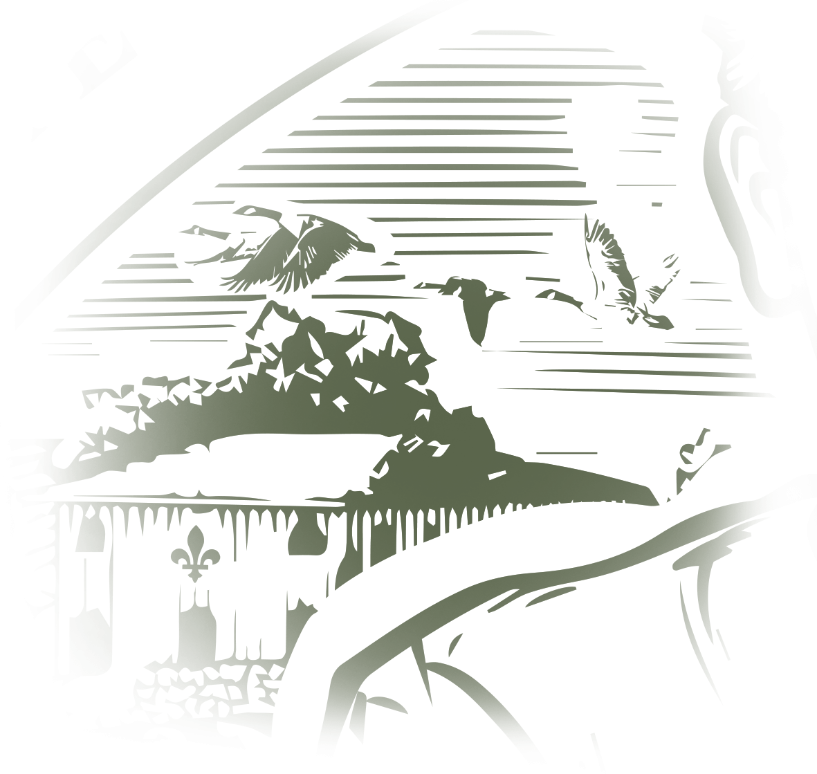
A Canada Goose (bernache) flies above the village, symbolizing the family's journey of immigration and linking their past to their new Canadian home.

The flags of Canada and Quebec are subtlety placed on the collar, celebrating the family's proud new identity and integration into their home.

The name "Nick" embroidered on the coat isn't just a label; it's a personal signature and a direct promise of quality from the family to the customer.

The Fleur-de-lys, a distinct symbol of Quebec, is proudly placed on the home, reinforcing the family's deep roots in the local community.
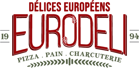
The "O" in EURODELI integrates two stalks of wheat, symbolizing renewal and a commitment to using natural, quality ingredients.
The final logo is a timeless masterpiece of storytelling. The chosen colors are equally significant: bordeaux red evokes passion and honesty, while olive green symbolizes the purity and quality of authentic products. This emblem doesn't just represent a business; it honors a legacy and reinforces Euro Deli's position as a true community landmark, delivering on its promise of "The Taste of Happiness since 1994."